Publishing Data
After registering a new dataset in Dojo, you will be able to jump to Causemos to see the results and refine the presentation to appropriate defaults for analysis use.
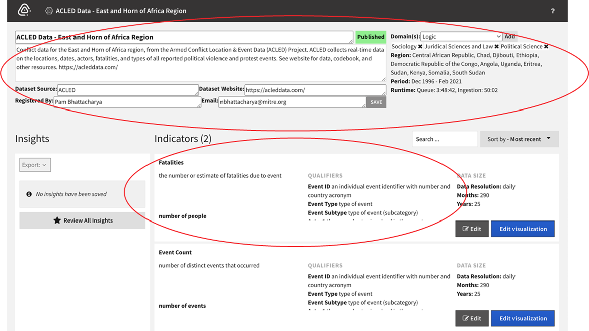
In Causemos, each whole dataset has one space where analysts can enrich its metadata and configure visualization options (such as aggregation functions) for one or all of its datacubes.
To enrich a dataset, you can edit any of its metadata, such as descriptions, provenance information, and applicable domains. You can also edit its indicator metadata. Indicators are data that indicate or summarize the current or past state of something. They roll up information into one element, such as GDP as an indicator of the economy in a country during a calendar year.
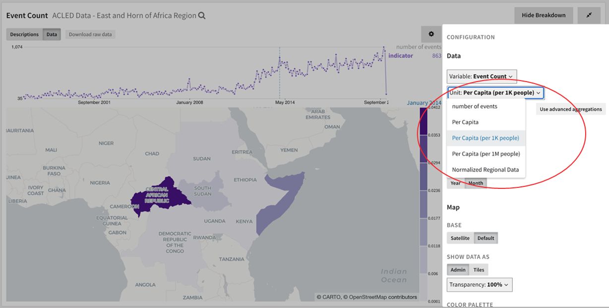
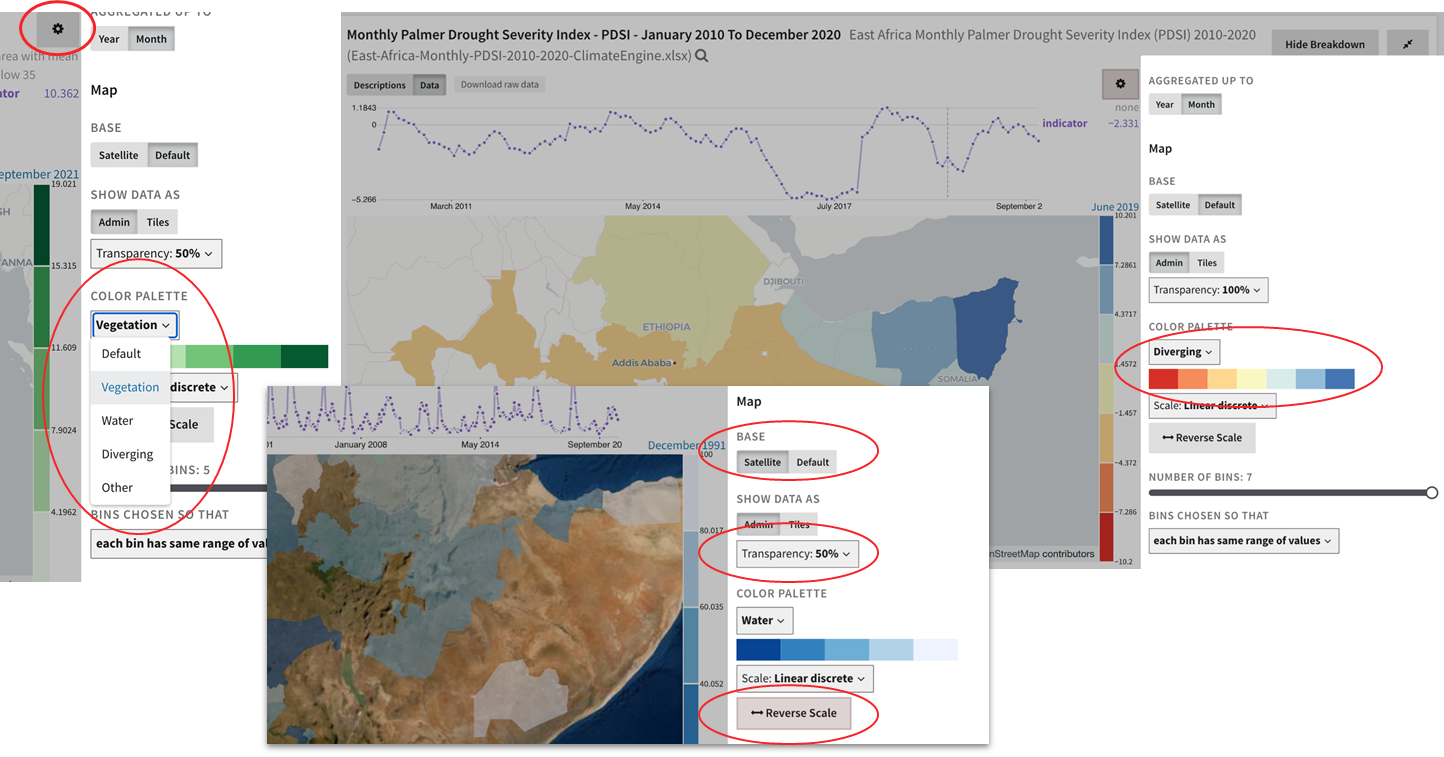
Numerous visualization options for datasets include:
- Aggregation (e.g. mean for an average or ratio, and sum for counts such as number of people).
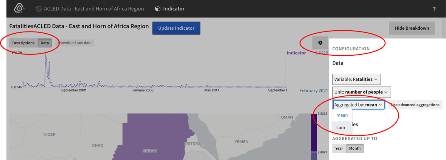
- Units (such as per capita, or normalized).
- Color Scales to adjust how the data appears on the map.
The configuration of one indicator can be applied to the rest of the indicators in the dataset if desired.