Qualitative Analysis in Causemos
The following workflow example illustrates how analysts can leverage suggestions, evidence, and relationships to quickly augment their mental models.
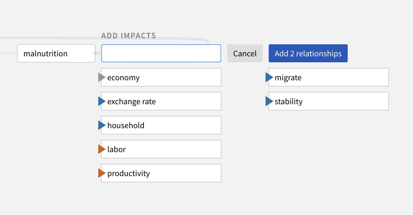
Assemble the CAG (leveraging tools from the Corpus Ingestion and Assembly Toolkit), and augment your concepts and relationships with system suggestions from the knowledge base.
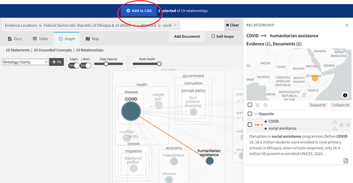
Click a relationship to review underlying relationship evidence automatically retrieved from the knowledge base.
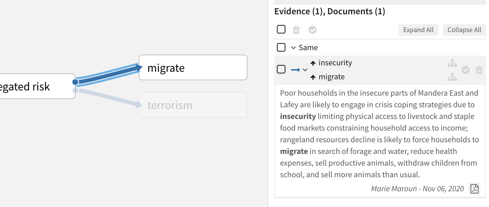
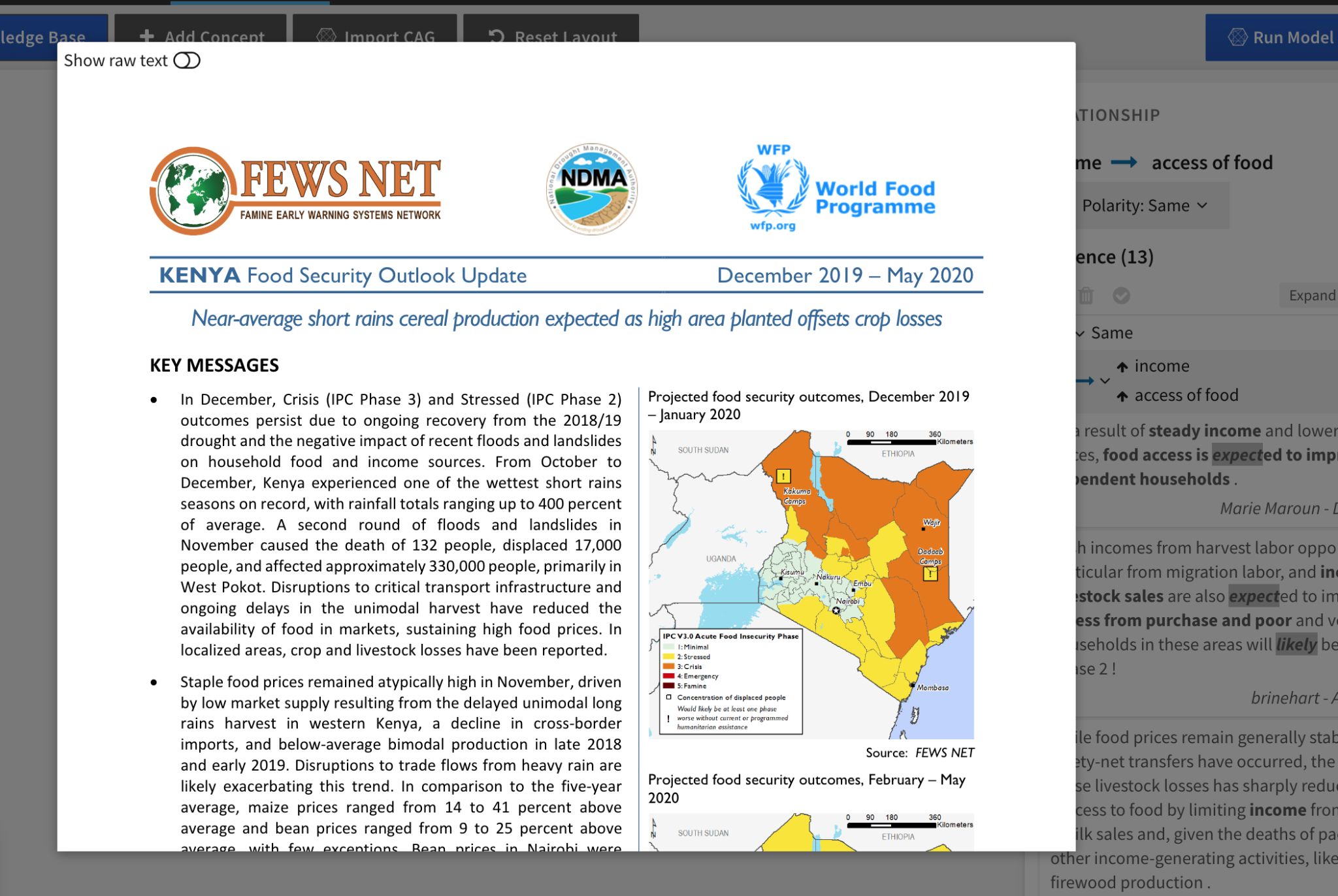
For full context, click a reference in the Evidence panel to open the source document from which it was extracted.
Click Search Knowledge Base to discover new relationships in the knowledge base explorer. Review the Knowledge Base facets to get a sense of the types of available documents, relationships, and evidence quality. Click any of the values to filter the visible data in the knowledge base explorer.
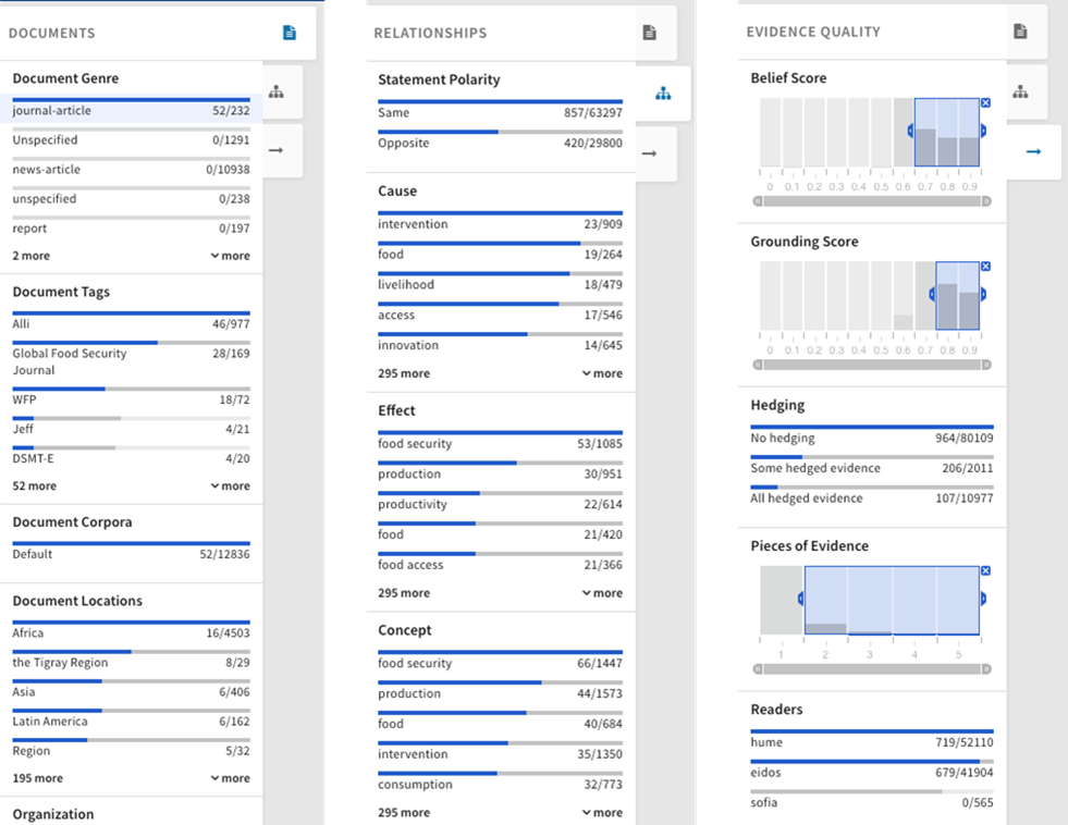
Select relationships in the Graph view of the knowledge base to add them to the CAG.
CAQ Quantification
Quantification makes qualitative models less subjective, enabling the system to infer the nature of the relationships. The system provides a head start on quantification by automatically matching datacubes to concepts. However, human judgment is needed to validate the defaults and resolve any data quality issues.
The following workflow examples illustrate the process of quantifying a CAG and performing a scenario analysis with quantified nodes.
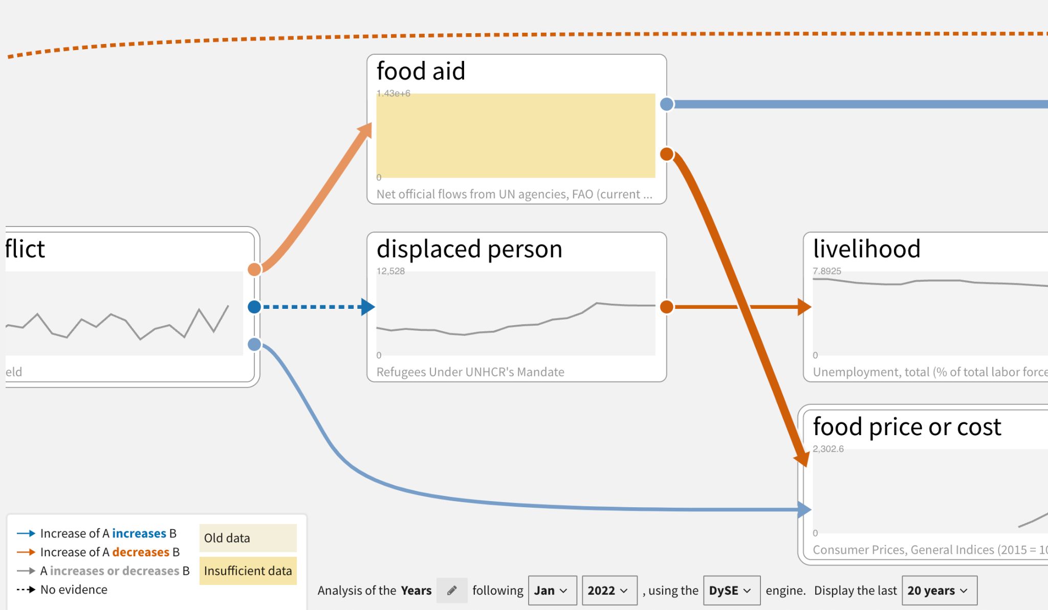
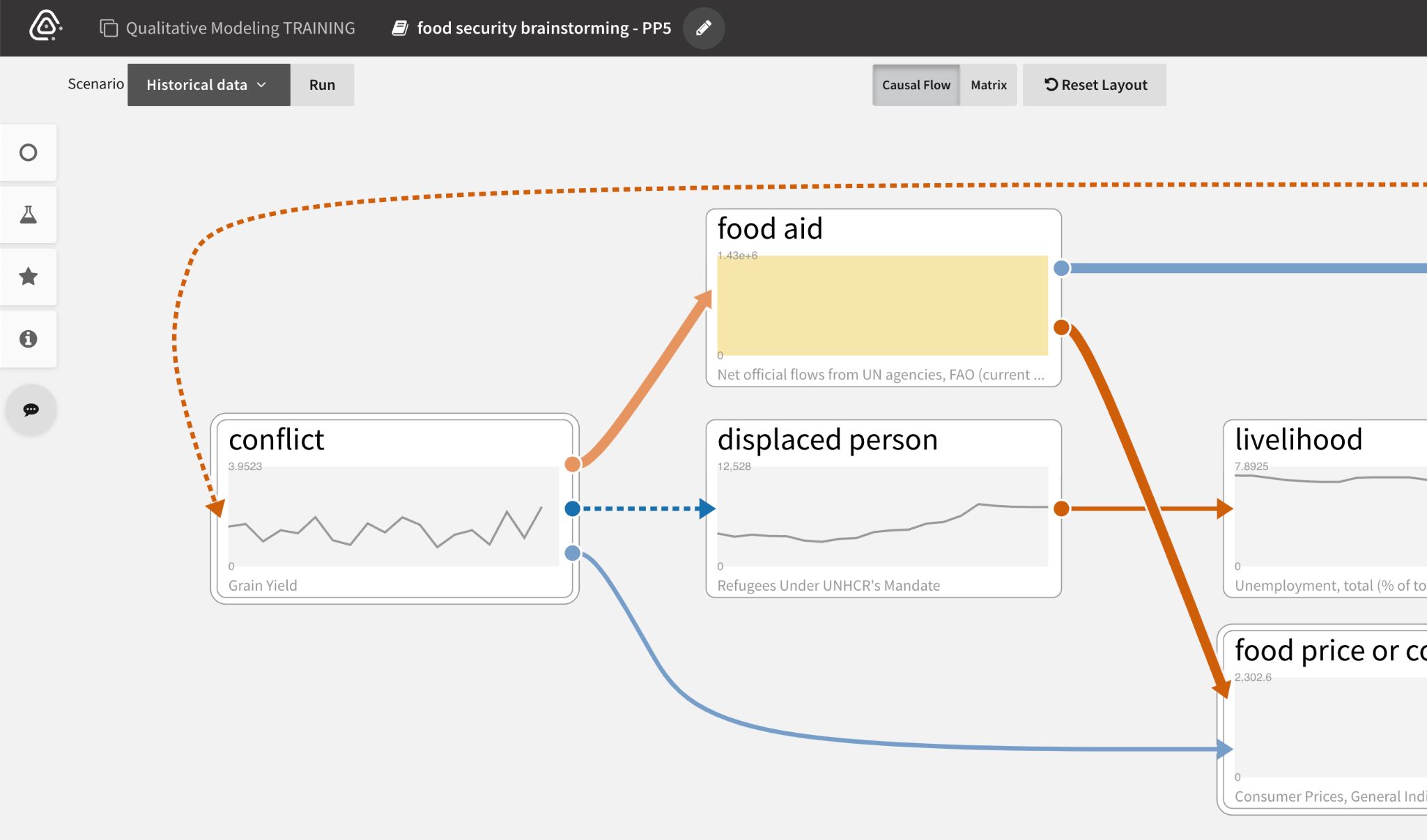
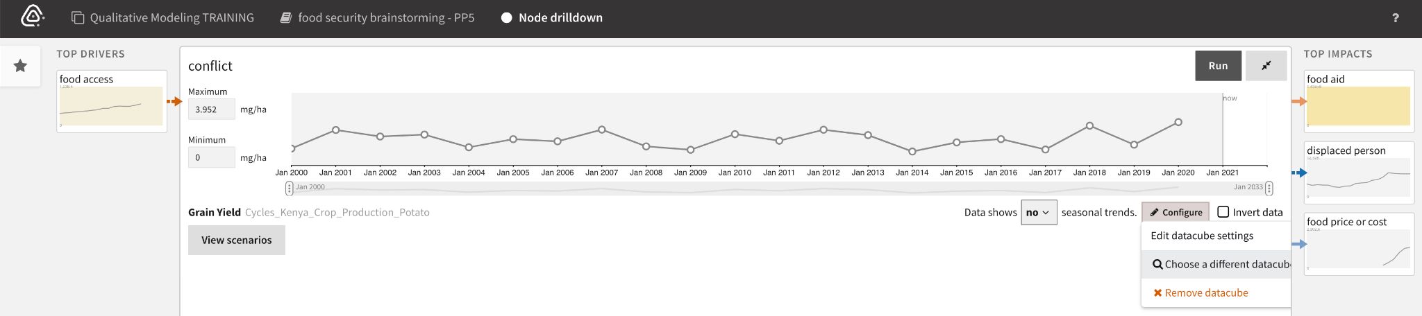
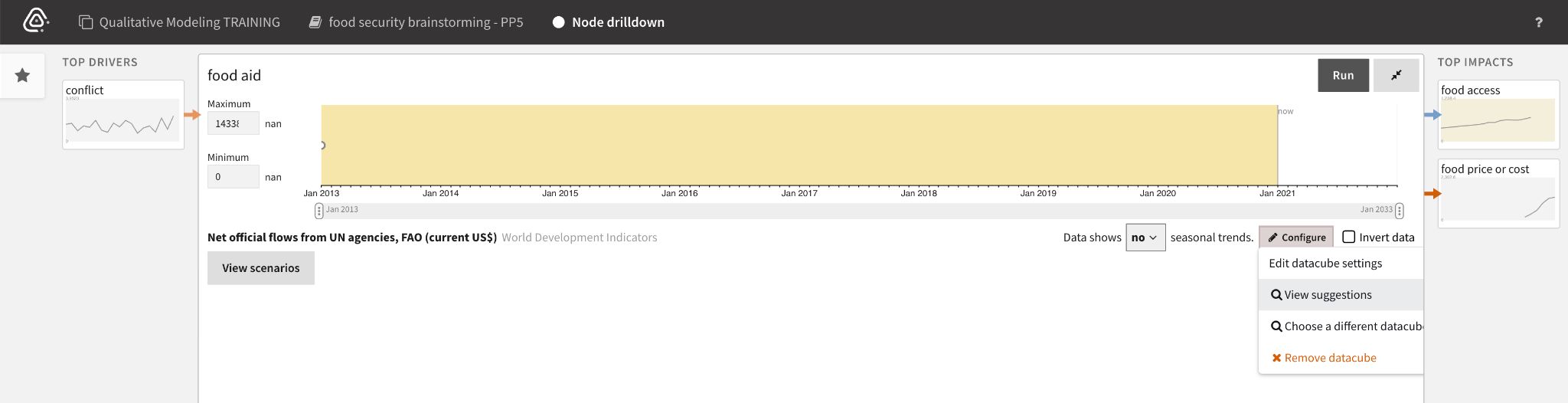
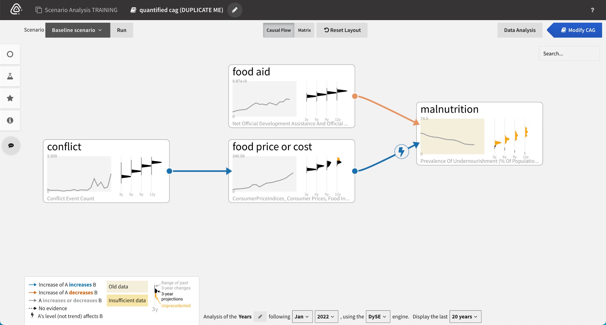
When an analyst begins to Analyze Scenarios, the system automatically matches datacubes to the concepts in the CAG. Nodes with yellow backgrounds indicate old or insufficient data.
Analysts can drill down on data quality issues by double click the affected node to see more details.
Different corrective actions are available depending on the quality issue. If the data is:
- Incorrectly mapped, analysts can Choose a different datacube by searching and filtering the datacube explorer.
- Insufficient (has very few data points), analysts can View suggestions of other relevant datacubes to use.
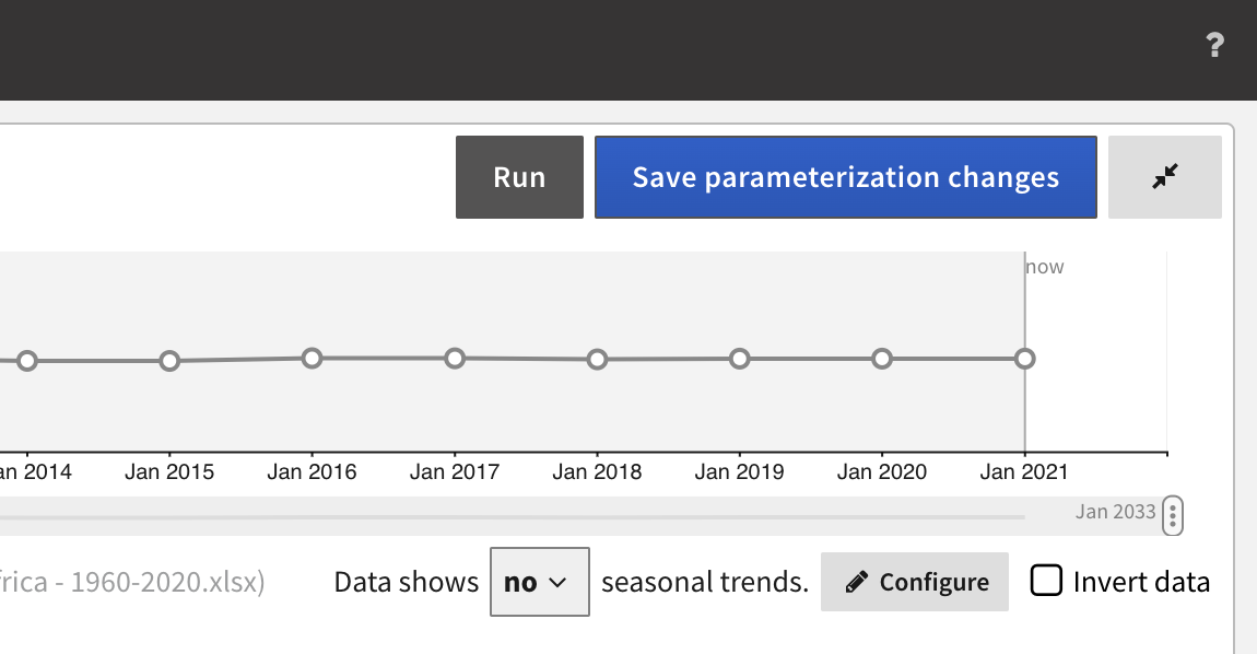
- Old, analysts can manually fill gaps with prior knowledge and Save parameterization changes.
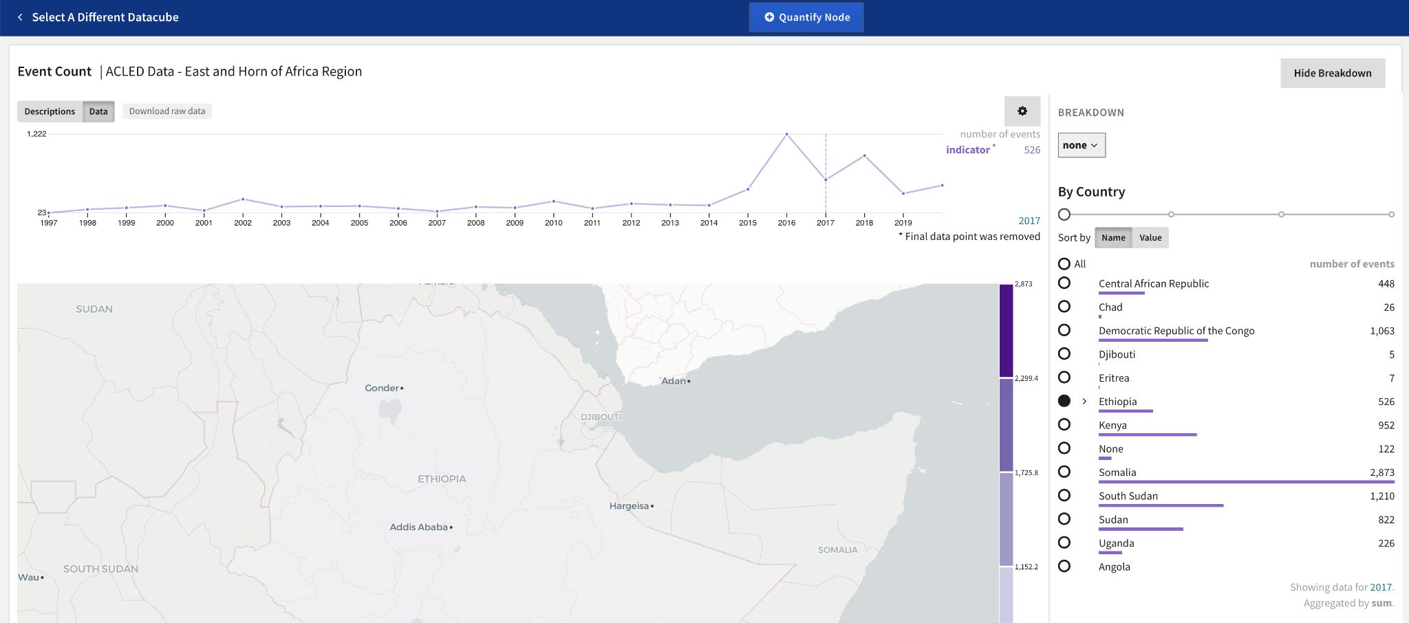
To find relevant data to replace insufficient or incorrectly mapped datacubes, analysts search the available datacubes or filter them using the facets.
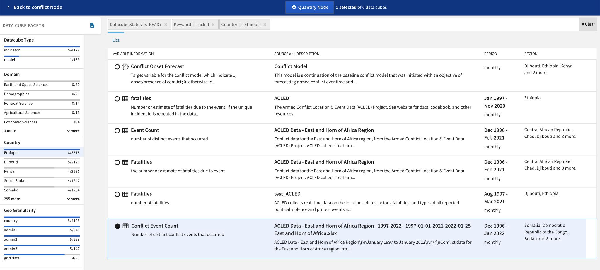
The Breakdown panel for a selected datacube lets analysts specify its spatial scope before quantifying the node.
Projections
Projections in the scenario analysis workflow allow analysts to see the distribution of results at various time intervals. Running projections utilizes the inference engines DySE, Delphi, and Sensei (see individual engine sections for more information about their methodology).
Note: Projections are trends based on incoming influences, not accurate predictions.
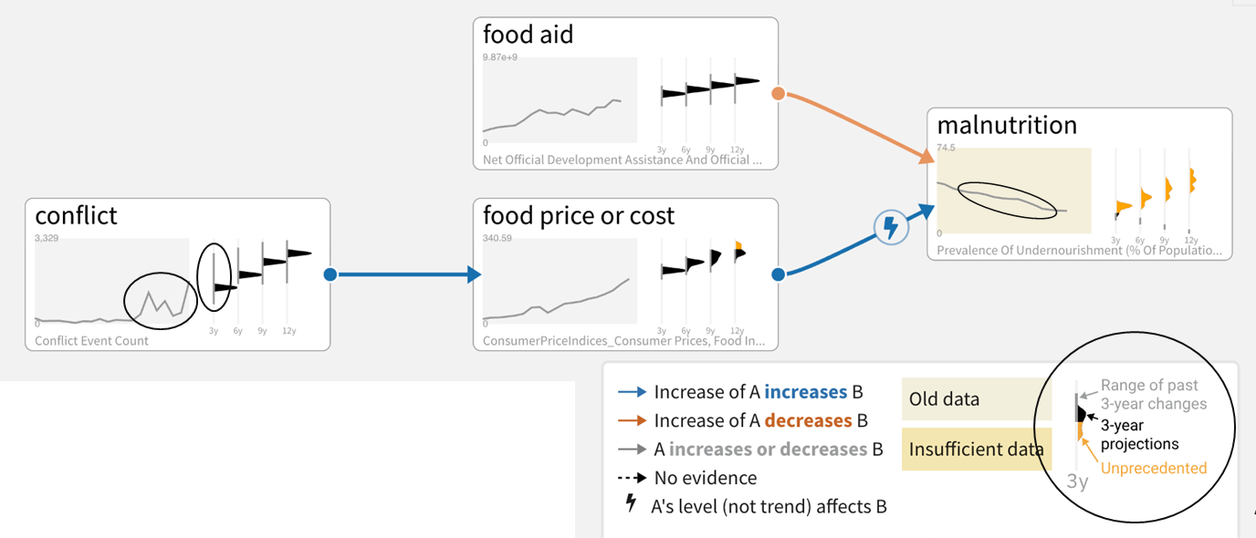
Baseline scenarios have trends, projection time slices, and different types of relationships.
Historical data mapped to nodes is used by inference engines to:
- Set the range of possible values (max - min and buffer top and bottom).
- Situate the initial value for the projections in that range.
- Infer the nature of edges
The system produces trends for ‘head’ nodes only. ‘Head’ nodes are those that do not have any incoming/upstream causal drivers.
![Trends inferred from historical data (black) and resulting from incoming influences (orange).]
Historical context ranges provide a notion of how realistic the projections are (based on whether such changes over the time window have been seen historically).
Sensemaking
Causemos supports many sensemaking capabilities that help analysts better understand large CAGs. Below are some examples of ranking and visualizing node sensitivity, influential paths, and feedback loops.
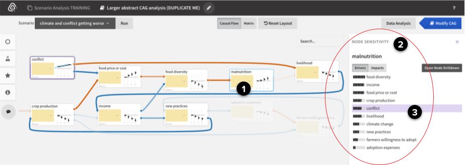
To understand node sensitivity in larger CAGs, we utilize the DySE engine’s Sensitivity Analysis capability (see the DySE section for more technical details):
- Select a node (malnutrition in this case, which is increasing) to rank its Top Drivers.
- Review the list of drivers. In this example, conflict is more responsible for malnutrition than climate change is.
- Select a driver (conflict) to see all the paths between it and the selected node (malnutrition).
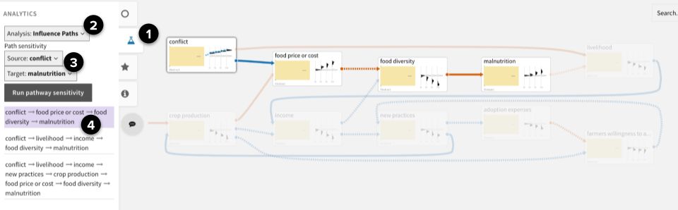
To find the most influential paths between two nodes in larger CAGs, we utilize the DySE engine’s Pathway Analysis capability (see the DySE section for more technical details):
- Open the Analytics panel.
- Select Analysis: Influence Paths.
- Select a Source (conflict) and Target (malnutrition), and then click Run pathway sensitivity.
- From the ranked list of paths, select a path to highlight it in the CAG.
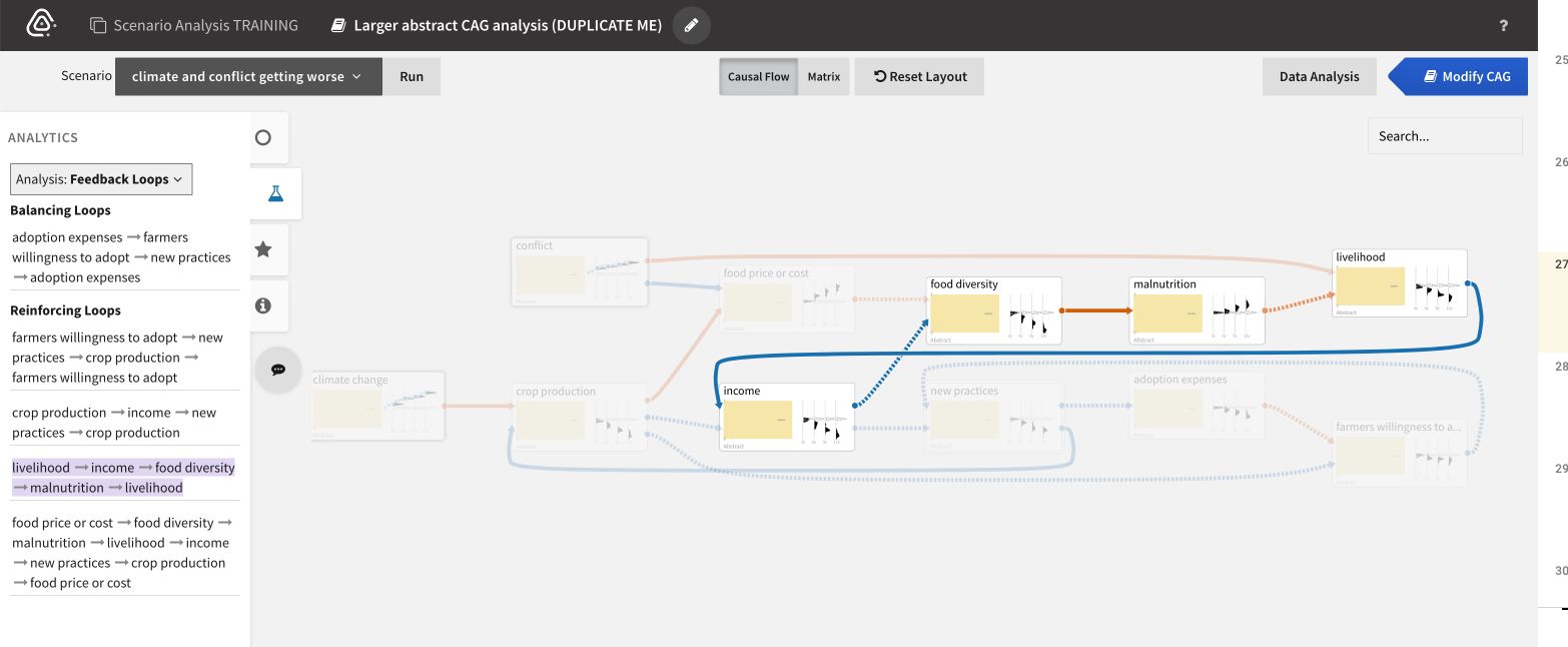
To find feedback loops in larger CAGs:
- Open the Analytics panel.
- Select Analysis: Feedback Loops.
- From the ranked list of loops, select a balancing or reinforcing loop to highlight it in the CAG.